Product Design & Development | Nonprofit
A Bilingual Bridge to Community Resources
Role
Product Designer & Builder
Platform
Web, responsive
Timeline
6 weeks, 0 → launch
Stack
React · Supabase · MapLibre · Vercel
OVERVIEW
Puente ATX came to me with a mission and nothing else: no brand, no site, no database, no name on a business card. The organization connects Central Texas families — through navigators, promotoras, and church volunteers — to food pantries, rental assistance, clinics, legal aid, and school programs. The services were real and funded. The information about them lived in PDFs emailed between case workers, in spreadsheets with dead phone numbers, in nobody's memory but the volunteers who did this by hand.
I designed and built the entire product myself — brand, UX, information architecture, database, and front end — using Claude Code and Codex as my implementation partners rather than a traditional engineering team. That ownership started before any screen existed: buying the domain and choosing the stack — React on Vercel, Supabase for data, MapLibre for maps — were decisions I made myself, not handed off to an engineering lead.
The result shipped as four connected products on one shared design system and database: a bilingual resource directory, a proximity-based finder, a privacy-safe insights dashboard for the org's funders, and an admin console for managing and importing resources.
KEY OUTCOMES
SHIPPED
4 Products
Directory, proximity finder, insights dashboard, and admin console
SCALE
~440 Records
Bilingual resources verified across 5 counties from 8 source documents
OWNERSHIP
0 → Launch
Brand through full-stack build, solo, in six weeks
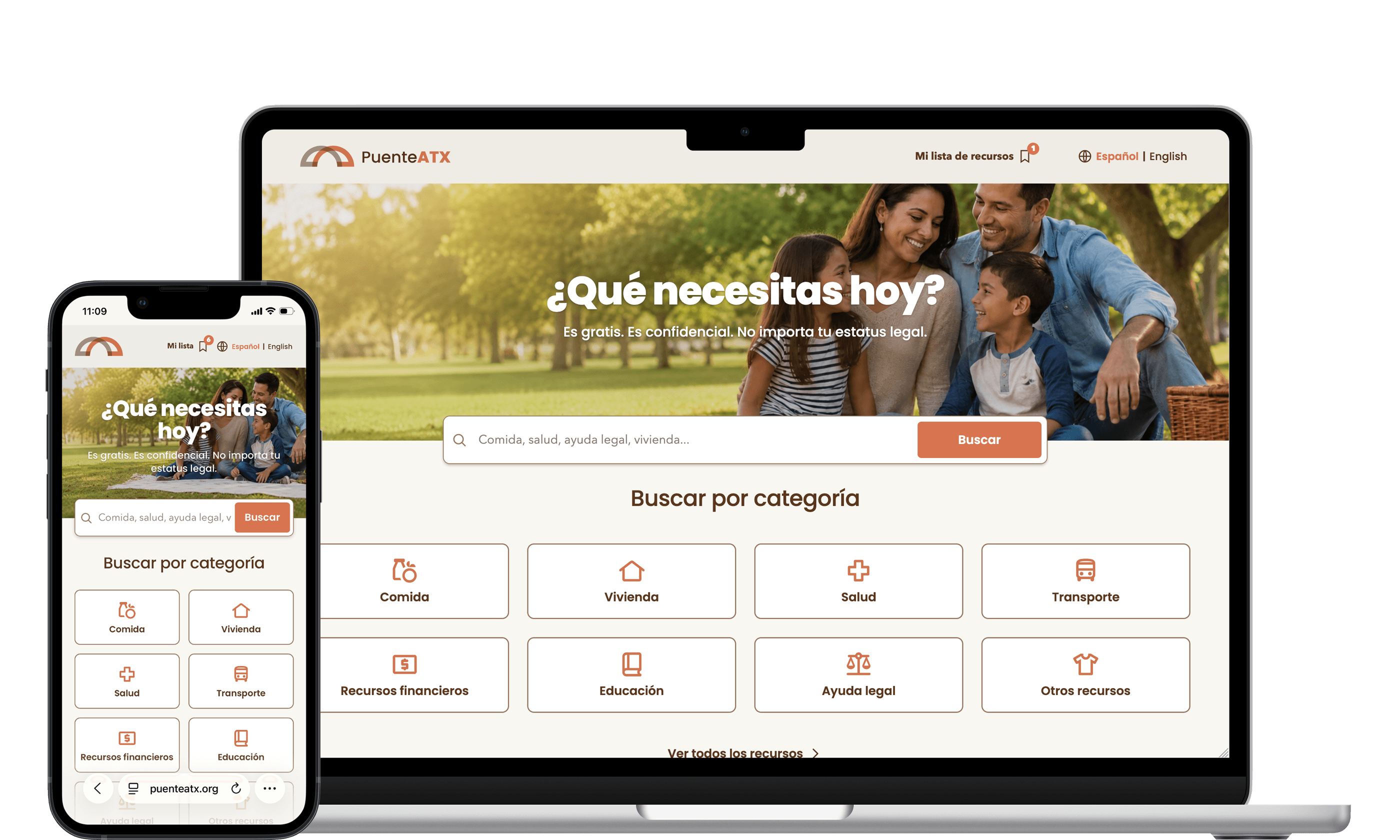
Puente ATX homepage, desktop + mobile
SITUATION
The Help Exists. Finding It Doesn't.
Food pantries, rental assistance, clinics, legal aid, school programs — across Central Texas the services are real and funded. The information about them is not reliably available anywhere. A family that needs rent help this week has to know which organization to call, whether they qualify, whether anyone there speaks Spanish, and whether the address on last year's flyer is still an address.
The people doing that connecting — navigators, promotoras, church volunteers — were doing it from memory and paper.
Four decisions, made before any screen was designed, shaped everything that followed:
01
Spanish first
Not "Spanish available." The default locale is Spanish; English is the toggle.
02
Phone first, often offline
44px targets, a list that works when the map fails, a real print stylesheet.
03
Trust is a design problem
A directory that lists a closed pantry is worse than no directory at all.
04
No accounts, ever
Asking an undocumented family to register is asking them to leave.
TASK
Design a System an Entire Organization Could Trust
The goal wasn't a prettier list of phone numbers. It was a product an immigrant-serving nonprofit could put its name on: something a promotora could hand a family with confidence, and something the organization could use to talk to funders about where the need actually was.
Key objectives:
- A warm brand system that felt like a neighbor, not an institution
- Search that matched how people actually describe their problem, in either language
- A second, faster path for "what's near me right now"
- An analytics layer that could inform funders without identifying anyone
- A way to turn eight inconsistent community documents into one verified database
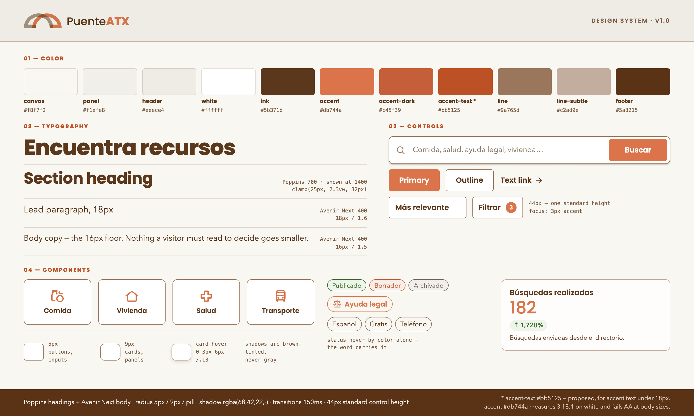
Puente ATX design system: tokens, type scale, and components
ACTION
1. A Brand That Doesn't Feel Institutional
The reference point for "government services website" is institutional blue, gray tables, and a tone that makes you feel processed. Puente ATX needed the opposite — it needed to feel like a neighbor gave you a phone number.
The palette is warm and earthed: a cream canvas, a deep brown ink instead of black, and a single terracotta accent that does all the pointing. Brown on cream reads at 9.75:1 contrast, so the warmth costs nothing in accessibility.
Ten tokens carry the whole system — three surfaces, two ink values, two accent values, three border weights — living as CSS custom properties that map directly into the front end, so the public site, the admin console, and the map product can't visually drift apart.
2. Designing Search for How People Actually Search
People don't type "housing." They type "no puedo pagar la renta." Search had to cover localized titles, organization names, summaries, keywords, categories, and service area — in both languages — with every filter state living in the URL, so a navigator could send a family a link instead of instructions.
A few decisions came directly from watching how this audience actually uses the web:
Saving without an identity
Saved resources live in the browser as a list of public slugs — no names, no accounts — and a list can be shared as a plain URL or WhatsApp message.Pagination, not infinite scroll
Six results, then a button. Infinite scroll breaks printing, sharing a position, and knowing how much is left — all of which this audience needs more than smoothness.Spanish sets the layout
Spanish runs roughly 20% longer than English, so every button, card, and label was sized to the longer string first. Every breakpoint in the product was set by Spanish, not English.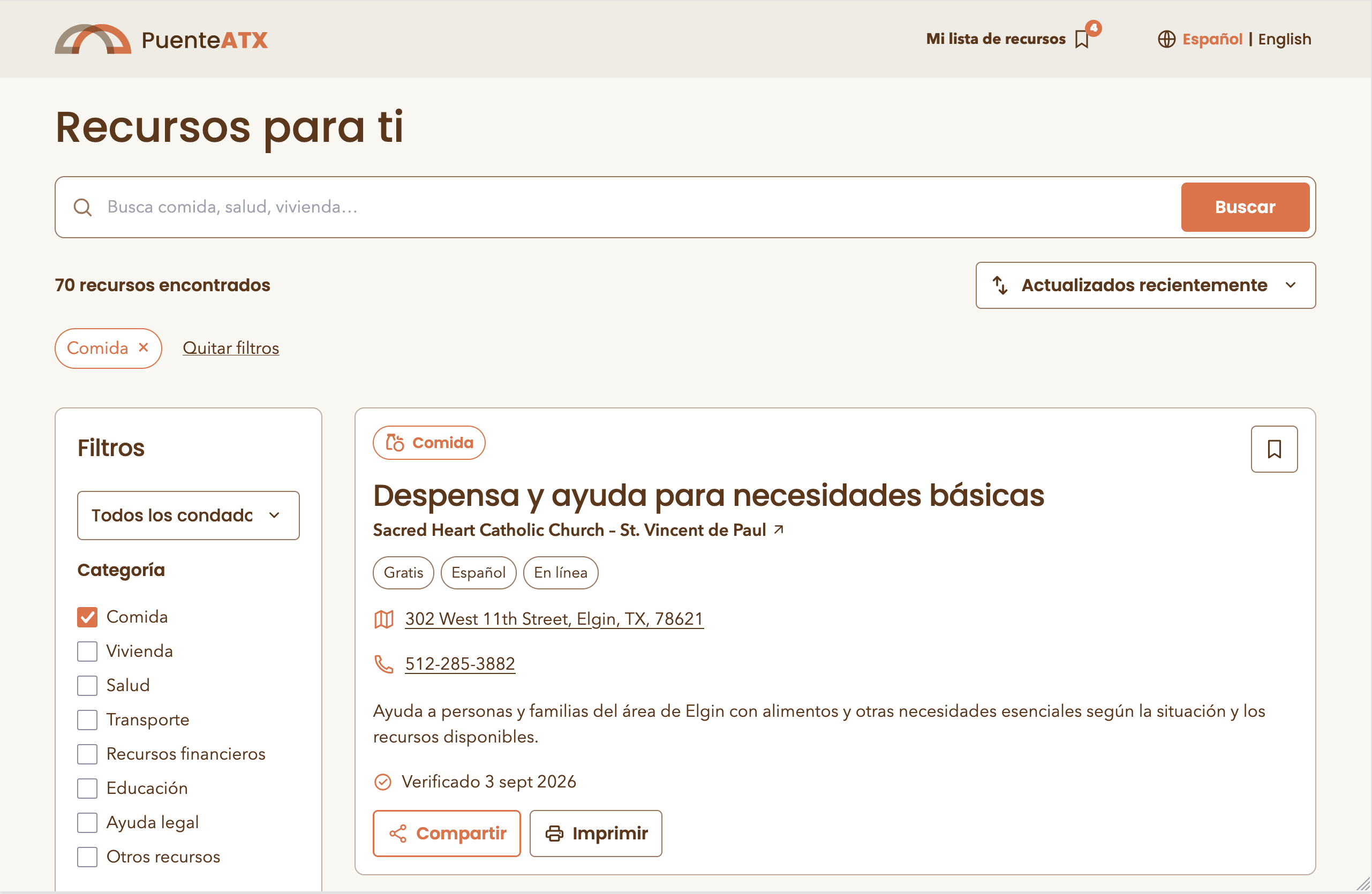
Results, filters, and the mobile filter sheet
3. A Second Product: "What's Near Me, Right Now"
Halfway through, a distinct problem surfaced: search-by-keyword is the wrong interaction when the real question is "what's near me right now." So I built a second product on the same database and the same design tokens — enter a ZIP code and an optional category, get the nearest resources with a list and map kept in sync.
The ZIP centroid comes from the U.S. Census 2024 Gazetteer, covering 100 official ZCTAs across five counties, and the search expands through a 15 → 30 → 50 mile radius until it finds something. Three principles kept it honest:
- The map is supplemental — the list holds every essential detail and stays usable if the tile provider goes down
- No invented coordinates — an address without a verified match stays unpositioned, and the interface says how many are pending review instead of dropping them silently
- No vendor lock-in — MapLibre GL with open tiles, no paid maps account, no private key shipped to the browser
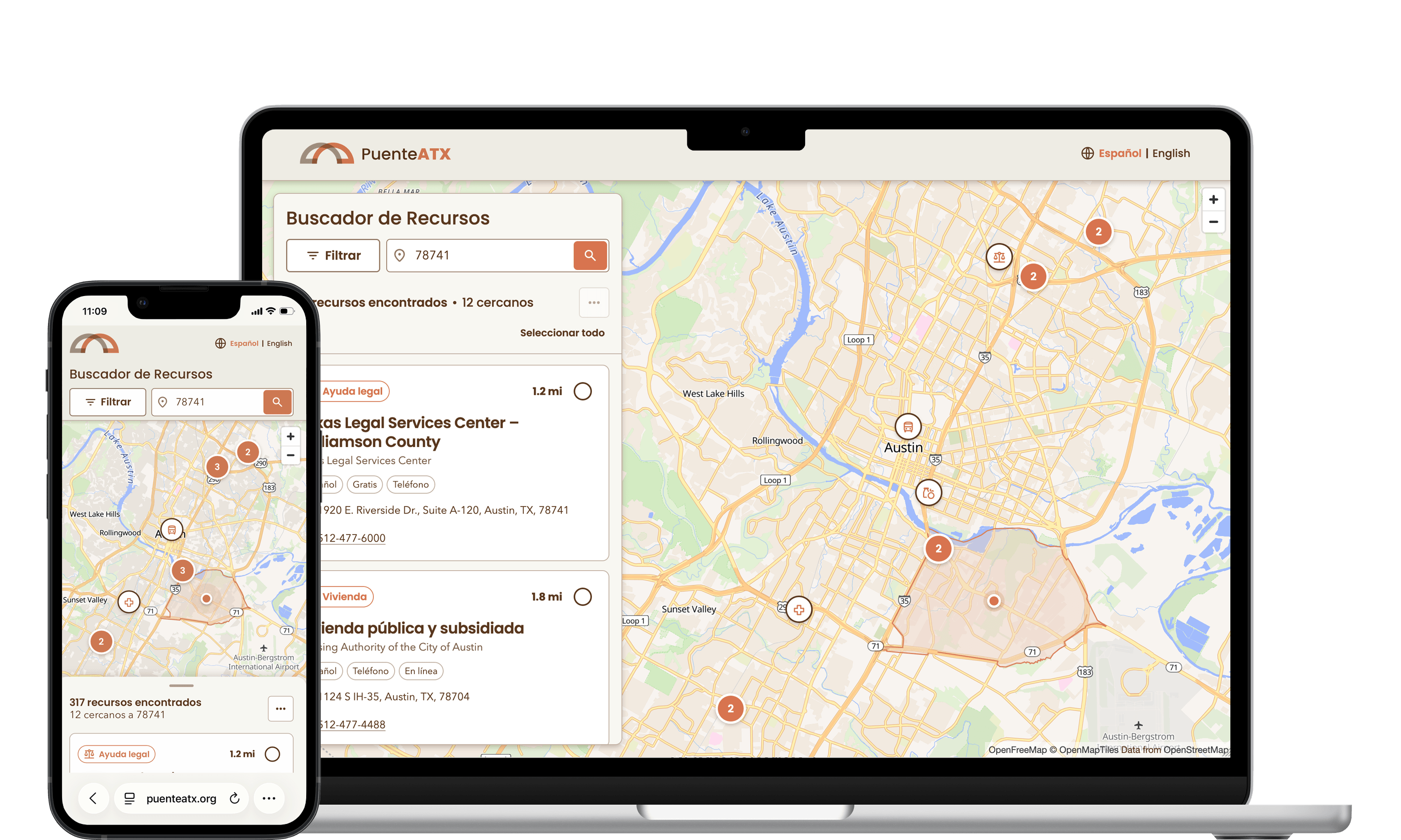
Buscador, the proximity-based finder, desktop split view
4. Measuring Need Without Surveilling People
Puente ATX needed real answers — which categories people search, which areas generate the most searches, what people look for and don't find — to talk to funders and decide where to recruit resources next. For an immigrant-serving organization, that makes the analytics layer a safety question before it's a growth question.
The constraint was written before the first event ever fired: the system must be unable to identify anyone, including me. In practice that meant a closed allowlist of 16 approved events, no writes directly from the browser, aggregate-only reads behind server-verified functions, and hard anonymity thresholds enforced in the database — an area only appears on the needs map with 20+ searches behind it, and suppressed counts never leave PostgreSQL, not even in a CSV export.
Every metric ships with a published definition of its formula, its source, and its limitations, stated on the dashboard itself — "contact actions" counts a tap on a phone number, and says plainly that it doesn't measure whether anyone answered.
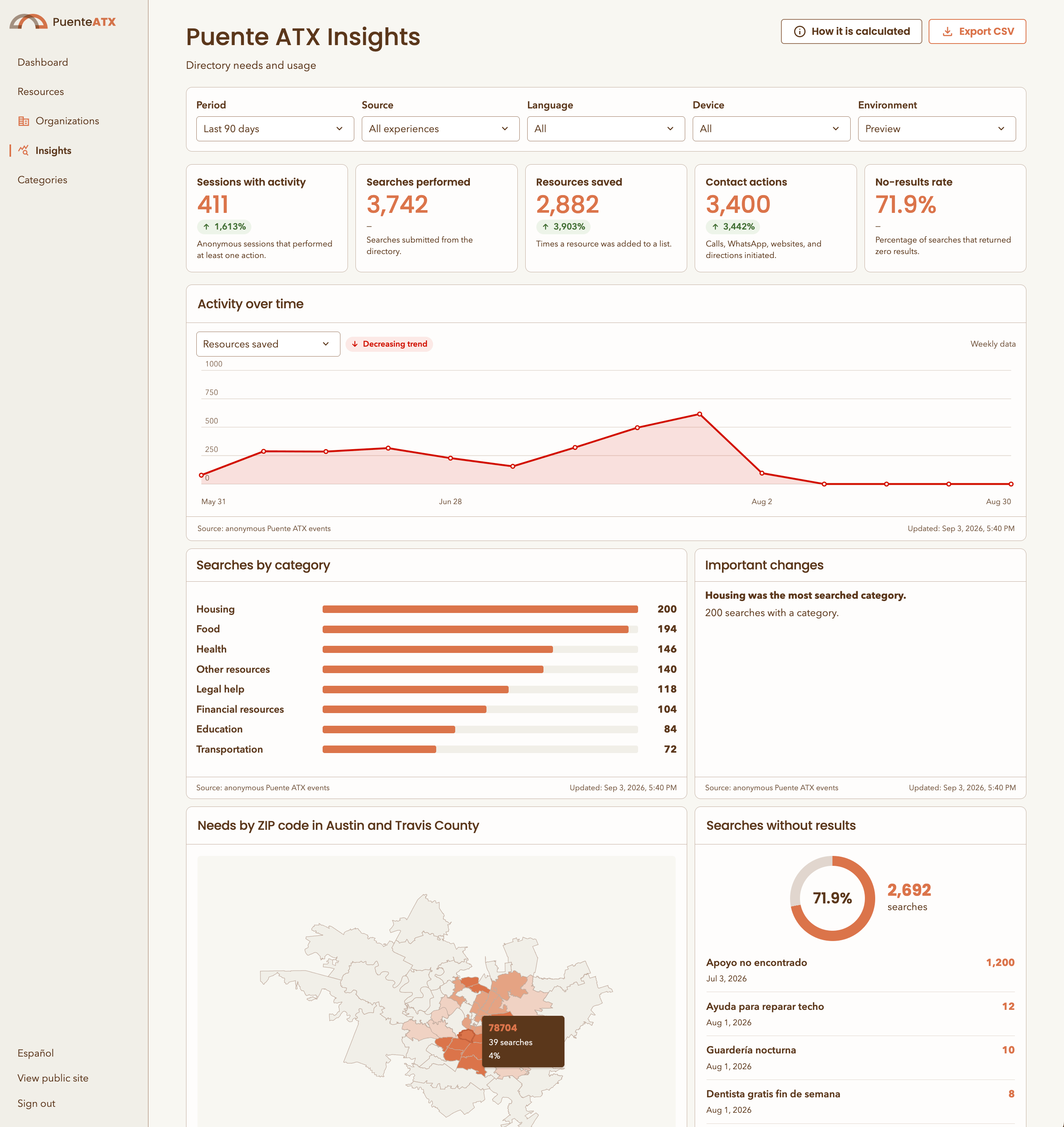
Insights dashboard: privacy-safe, aggregate-only analytics for the org's funders
5. Building It: Spec First, Then Code
The implementation was written with Codex and Claude Code, but the leverage was never in generating code faster — it was in writing the specification first. Every subsystem got a document before it got a component: the resource system, the finder, the analytics contract, the admin console, the map methodology. Those documents defined the data model, the routes, the security posture, and an explicit list of things the system must never do — and they stayed in the repository as the source of truth, not a one-time planning artifact.
That inversion is what let a six-week scope survive contact with reality. When the dashboard needed a new metric, the change started in the data dictionary, not the chart. When the finder needed a fifth county, the expansion procedure was already written down.
The least glamorous piece was the most valuable: a review-and-import pipeline that turned eight community documents — a family resource guide, an eviction solidarity handbook, a counseling list, a healthcare catalog, a county roster — into roughly 440 validated bilingual records. Duplicates were consolidated, URLs recovered from Excel hyperlink objects, missing Spanish translated, and every record landed as a draft with an import report naming the judgment calls made along the way. Converting a document is not the same as verifying a fact, and the system says so.
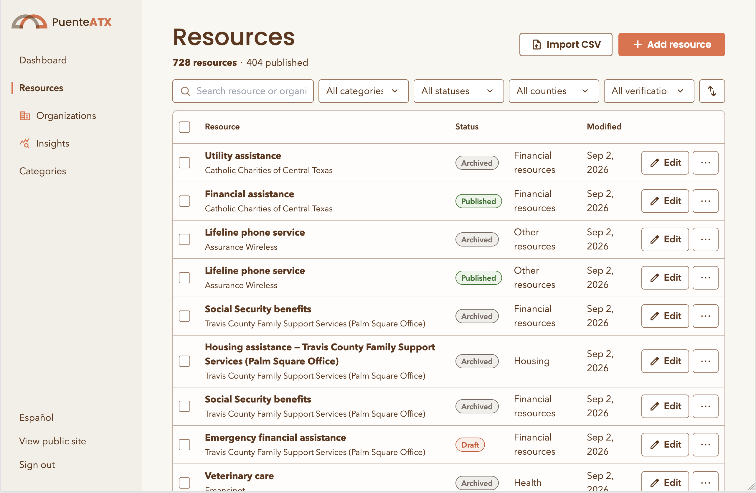
Admin console and CSV import pipeline
RESULT
A Product an Organization Could Put Its Name On
What shipped, solo, in six weeks:
- 4 products — directory, finder, insights dashboard, admin console
- ~440 bilingual resource records verified from 8 source documents
- 5 counties covered, 100 official ZIP centroids
- 19 database migrations, row-level security enabled and forced
- 0 visitor accounts required, zero personal data stored
Beyond what shipped, the project is a working answer to a question I get often: what does full-stack ownership look like when the "engineering team" is an AI coding assistant and a written spec. Design judgment didn't get smaller in that setup — it became the whole job.