UX / UI / Visual Design
Helping users make an informed decision when buying air purifiers
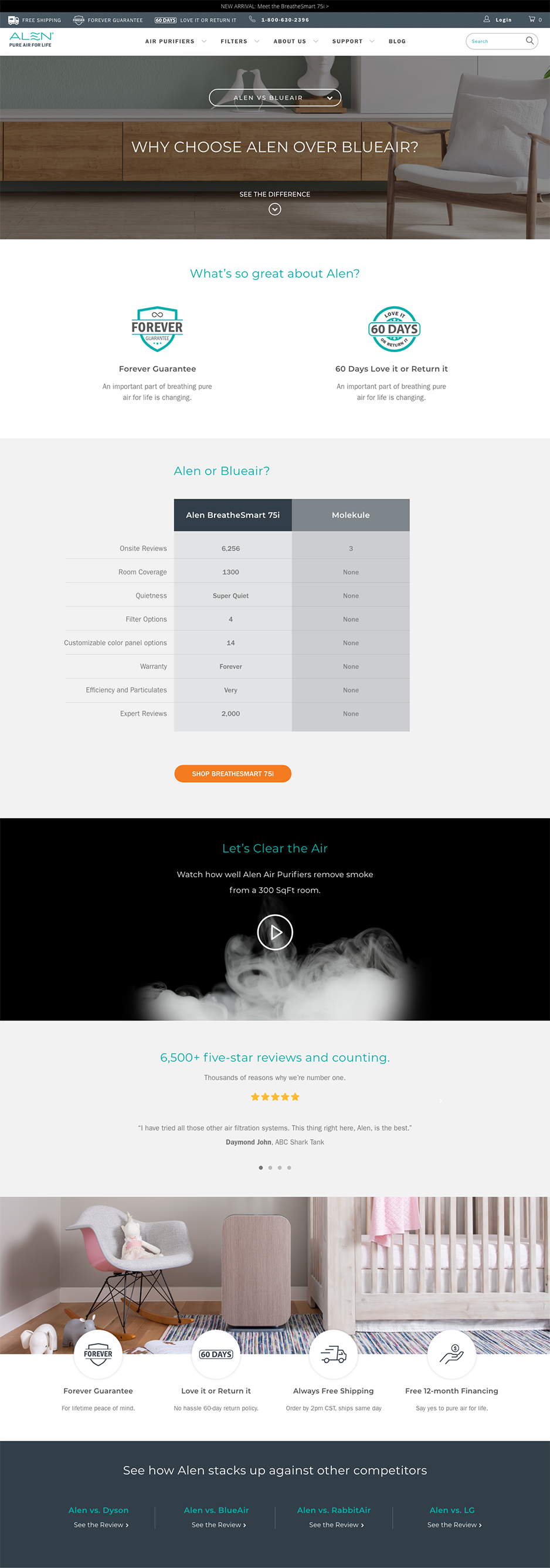
As a part of the Alen new strategy of establishing itself among the high end segment of air purifiers. The idea of creating a set of landing pages that would compare the Alen flagship units against its competitors’ equivalents. The user flow would be quite simple: people would come from a promotional email, a link on the main navigation or from the ‘model comparison table’ page. Once on the landing page, the user could pick a competitor’s brand to be compared side by side with an Alen unit. Right below the comparison table, the user will be given the choice to go to the specific Alen product page or continue to browsing through the ‘deep dive’ experience.

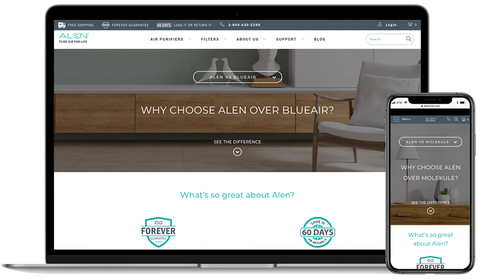
The content on these pages will be used to leverage the Alen’s brand value proposition as well as showing a video comparing side by side the efficiency of the Alen unit versus the competition in a smoke chamber. This page was designed and coded following the RWD best practices. The comparison table was implemented using an adaptive approach since it was not feasible nor efficient showing the same table layout and structure on mobile devices. A navigation was provided at the bottom just to allow users to go to the other unit comparison landing pages without going back to the top of the page. By designing these pages, Alen will leverage its advantages with comparable units in the competition and will allow customers to make a better informed decision when purchasing an air purifier.
Alen vs Competitors landing page in desktop and mobile version
