Product Design | Aviation
Redesigning Post-Flight Analysis for Pilots and Instructors
Role
Product Designer
Platform
Web
Team
Product, Engineering, Design
Research
+12 pilot interviews
OVERVIEW
ForeFlight already helped pilots plan and execute flights, but reviewing performance after landing required deeper analysis tools. Debrief was created to bring CloudAhoy’s flight analysis capabilities into a more approachable, ForeFlight-native experience.
The design challenge was to make complex flight data easier to understand and act on. Instead of simply adding more information, the experience needed to help pilots review a flight through map playback, scoring, segment analysis, profile graphs, and maneuver insights.
Debrief was a collaborative effort that began with early concepts and product direction from another designer. Building on that foundation, I helped refine the experience, explore interaction patterns, design key Track Logs flows, validate the solution through usability testing, and prepare the designs for engineering handoff.
KEY OUTCOMES
SHIPPED
MVP
Core Debrief experience live in ForeFlight for Web
STRATEGIC
Scalable IA
Foundational architecture supporting future analysis tools
OWNERSHIP
0 → Handoff
Early concepts to validated, engineer-ready designs
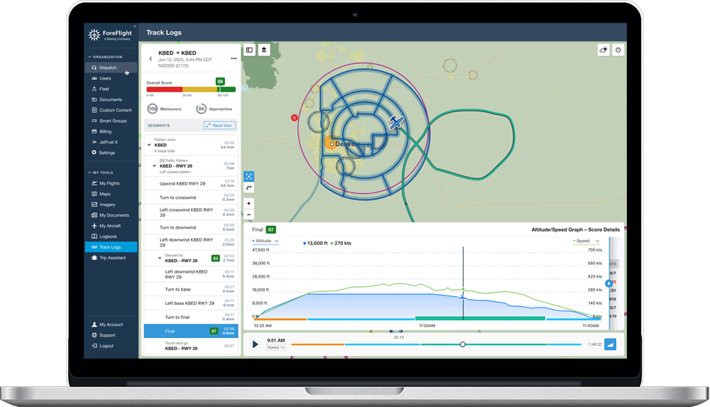
ForeFlight Debrief for Web, MVP
SITUATION
Expanding ForeFlight Beyond Flight Tracking
Pilots and instructors often review flights to understand what happened, evaluate performance, and identify opportunities for improvement. While flight data can provide valuable insights, analyzing that information requires navigating multiple layers of complexity, including flight paths, telemetry, scores, maneuvers, altitude changes, and event timelines.
The opportunity was not simply to expose more data. It was to create an experience that helped pilots move from observation to understanding.
A major challenge was organizing multiple layers of flight information into a structure that felt approachable while preserving the depth expected by experienced pilots and instructors.
At its core, the product needed to help users answer three questions:
01
How did the flight go?
Overall score and summary before any detail
02
What should I improve?
Score transparency tied to specific maneuvers
03
Where did it happen?
Map playback linked to segment and event data
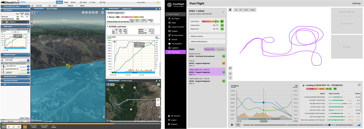
CloudAhoy and ForeFlight Debrief early explorations
TASK
Make Complex Flight Analysis Easier to Understand
The goal was to create a ForeFlight-native debriefing experience that balanced simplicity and analytical depth.
Success meant helping pilots quickly understand overall flight performance while still providing access to detailed information when needed.
Key objectives included:
- Creating a clearer information architecture
- Improving navigation between flight events and maneuvers
- Making score data easier to interpret
- Connecting map playback with performance insights
- Designing a scalable web experience that worked across screen sizes
- Preserving the depth valued by existing CloudAhoy users
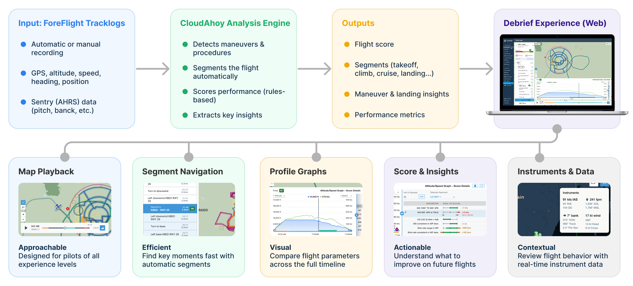
Foreflight Debrief Project Scope Diagram
ACTION
1. Learning From Pilots
Throughout the project, I interviewed more than 12 pilots, most of whom were already familiar with CloudAhoy.
The goal was to understand how pilots reviewed flights, what information they valued most, and where they experienced friction in existing workflows.
Several themes consistently emerged:
Pilots wanted a faster summary
Users appreciated detailed analytics, but they often wanted a quick understanding of overall performance before diving into individual events.Navigation was critical
Pilots frequently moved between flight segments, maneuvers, and specific moments in time. Efficient navigation proved just as important as the analysis itself.Context mattered more than scores
Scores were valuable indicators, but pilots wanted to understand why a score was assigned and which flight behaviors contributed to the result.These insights helped shape both the information architecture and interaction model of the product.
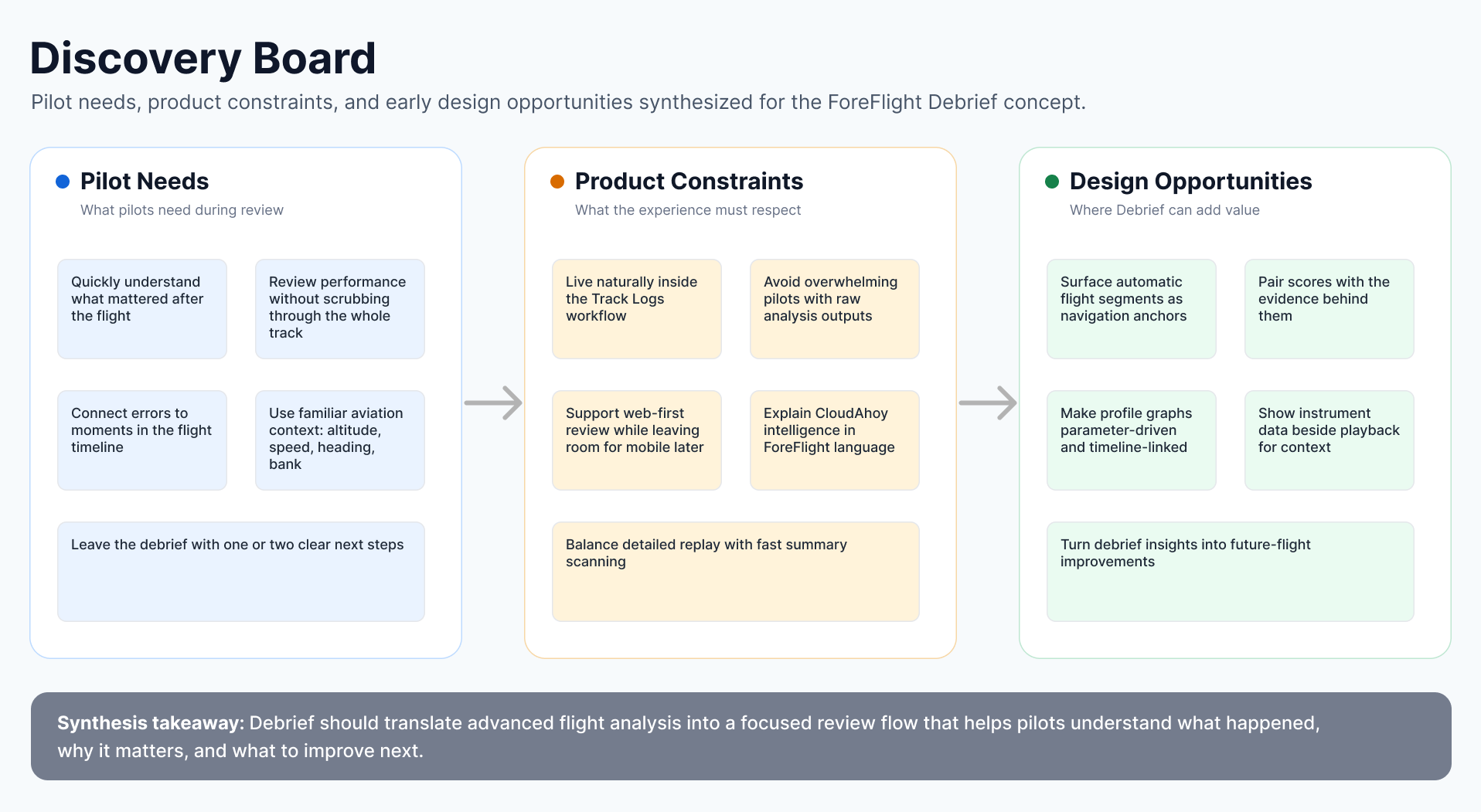
A recreated discovery board showing key questions, assumptions, and design opportunities.
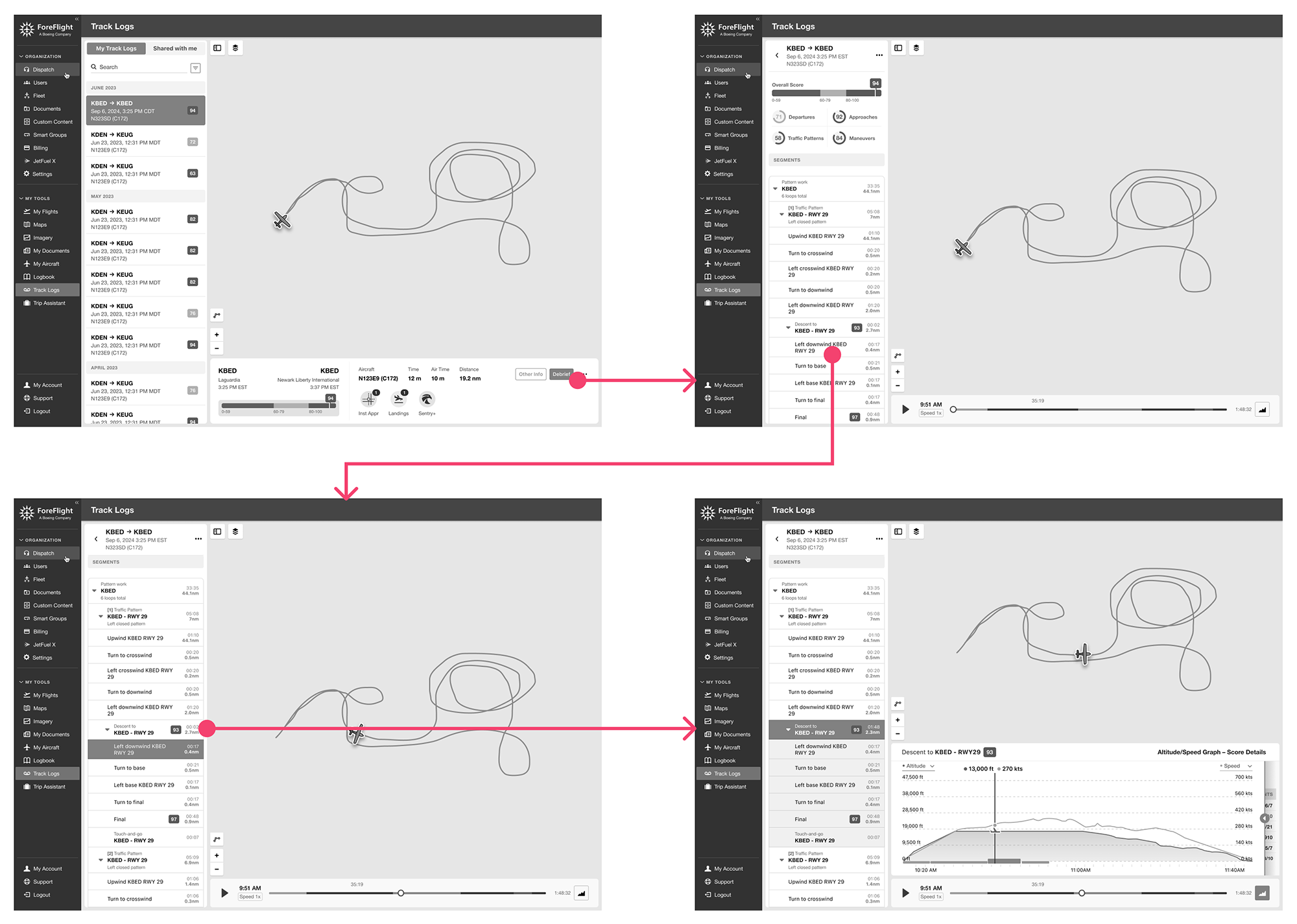
2. Designing the Core Review Workflow
One of the earliest challenges was defining how pilots should move through a flight review experience.
The team explored multiple approaches before converging on a workflow centered around:
- Reviewing overall flight performance
- Selecting a meaningful segment
- Replaying that segment on the map
- Exploring detailed performance insights
Wireframes showing the 'happy path' flow in Debrief
3. Reimagining Flight Segment Navigation
My first major contribution focused on the flight segment panel and the hierarchy of flight information.
The original structure made it difficult to understand relationships between different flight events and maneuvers. Pilots could access the information, but the hierarchy wasn't always clear.
I explored multiple approaches to:
- Nested segment relationships
- Expand and collapse behavior
- Scanability
- Context preservation
- Navigation efficiency
This became one of the foundational interaction patterns within the Debrief experience.
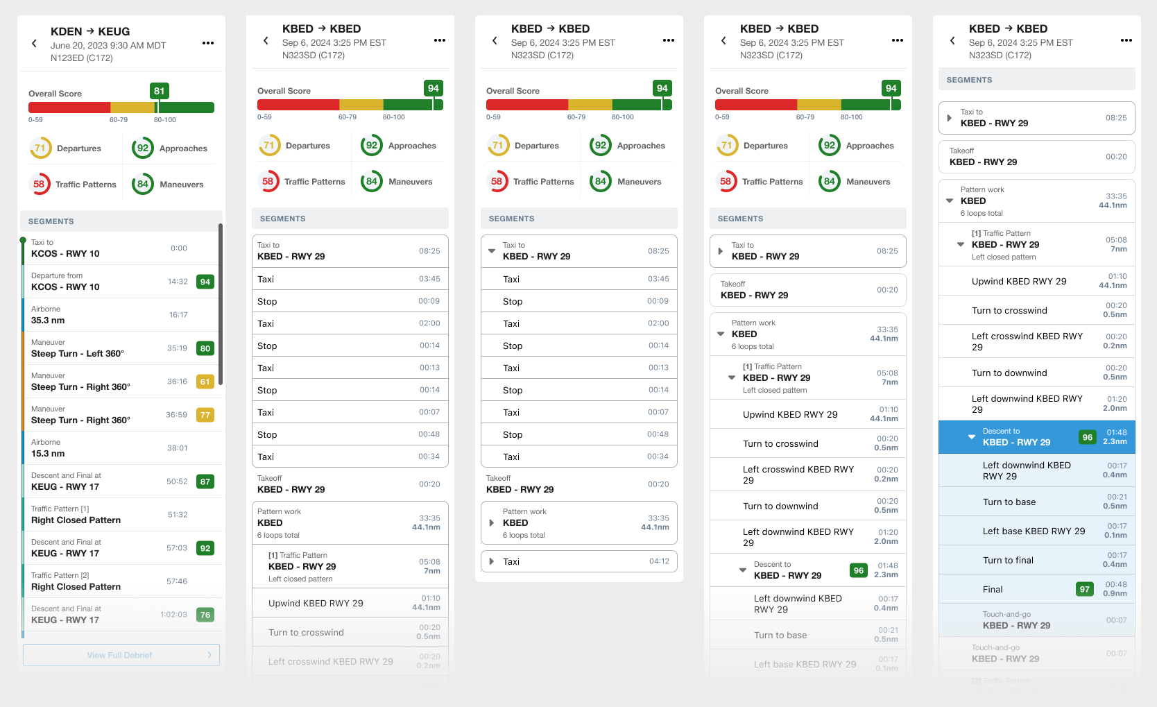
Debrief Segments. Interaction, segments' nesting and parent/child hierarchy explorations
4. Making Scores More Meaningful
A recurring theme from pilot feedback was that scores alone were not enough.
Pilots wanted to understand:
- Why a score was assigned
- Which behaviors influenced it
- What could be improved
The result transformed scores from simple indicators into learning tools.
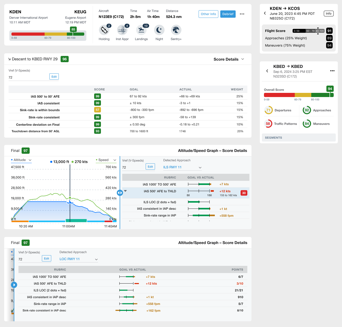
Debrief Score explorations. Final iterations used progressive disclosure to provide additional insights about the flight's maneuvers and segments.
5. Connecting Flight Data to the Map
Another challenge was helping pilots understand how performance data related to what happened during the flight.
To bridge this gap, I worked on the Profile Graph experience, which connected:
- Flight path
- Altitude changes
- Flight performance
- Segment selection
- Score information
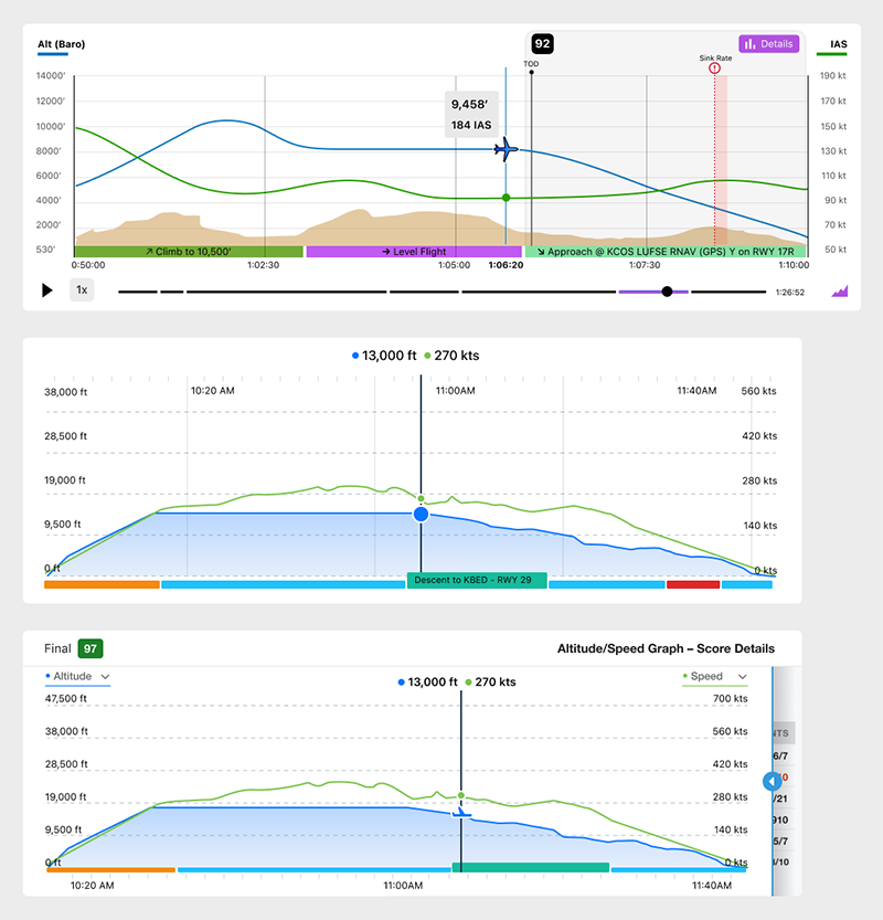
Foreflight Debrief Profile Graph explorations
6. Designing for a Real Web Product
Unlike the mobile experience, the web version supported a significantly deeper level of analysis.
The interface needed to adapt across screen sizes while preserving the same mental model and navigation structure.
I designed responsive layouts that balanced:
- Information density
- Readability
- Navigation efficiency
- Analytical depth
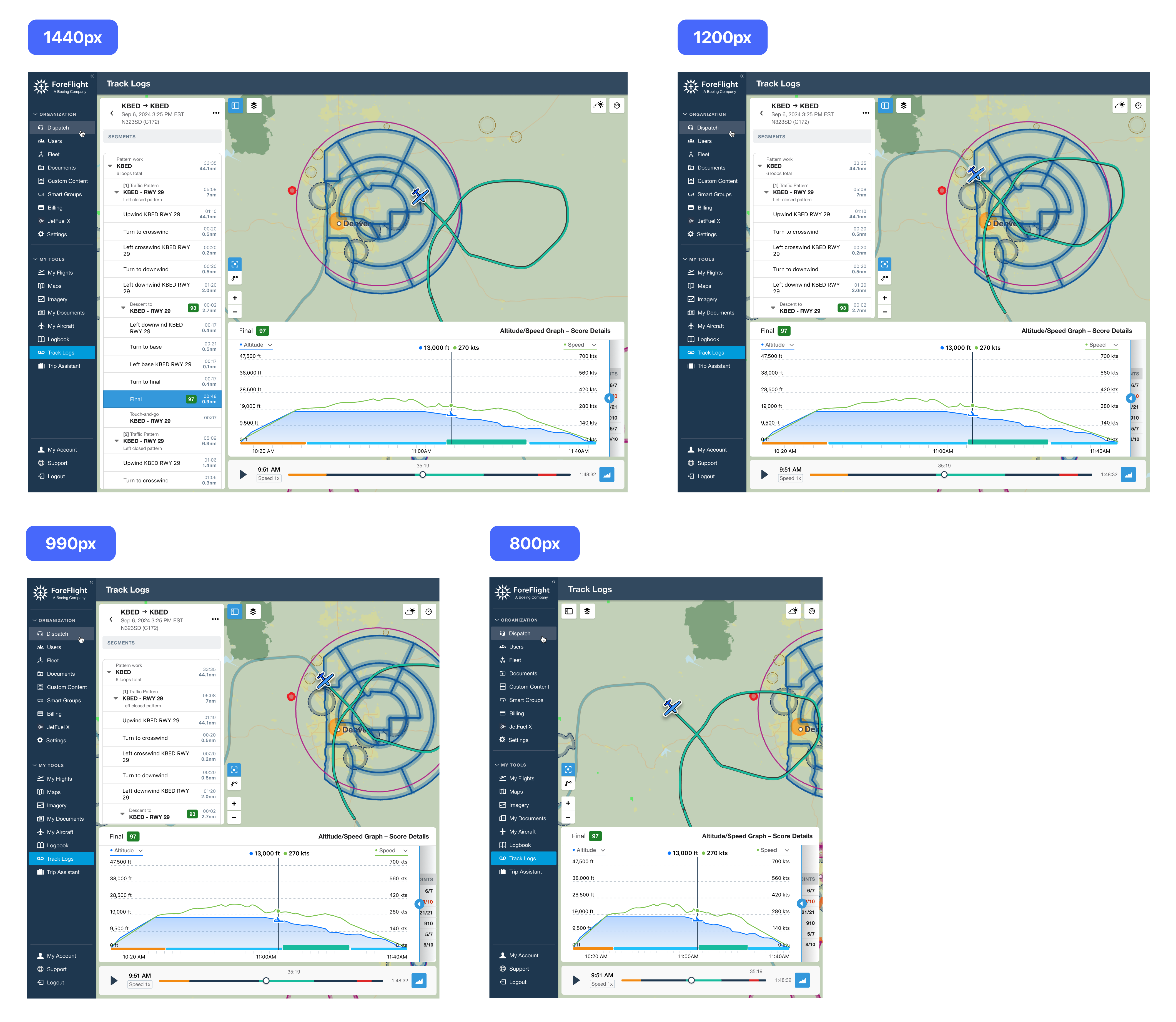
ForeFlight Debrief Responsive layouts/break points
7. Exploring Future Opportunities
As the core experience matured, I also explored concepts that could extend Debrief's analytical capabilities.
These explorations included:
Instrument Approach Debriefing
A concept focused on helping pilots evaluate performance during instrument approaches.Landing Performance Visualization
A concept designed to provide more detailed feedback around landing quality and performance.Although these concepts were not shipped, they helped establish a longer-term vision for the platform.
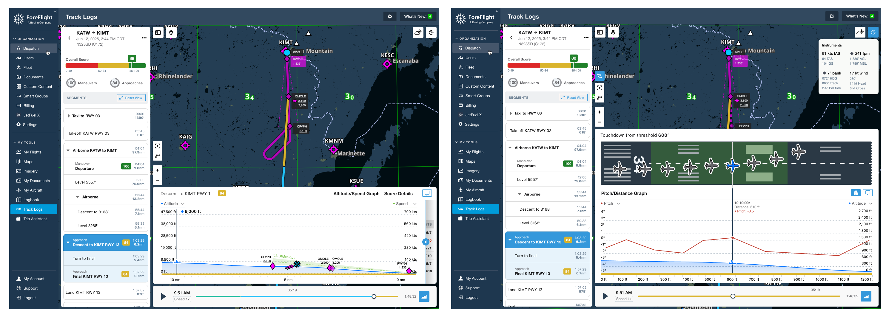
Instrument Approach Debriefing and Landing Performance Visualization explorations
RESULT
Establishing a Foundation for Advanced Flight Analysis
The final web Debrief experience brought together:
- Flight overview
- Segment navigation
- Nested flight structures
- Map playback
- Score details
- Profile graph analysis
- Responsive web behavior
Beyond the shipped features, the project established a scalable information architecture capable of supporting future analysis tools and advanced training workflows.