UX / UI / Visual Design
Redesigning the experience of customizing an air purifier
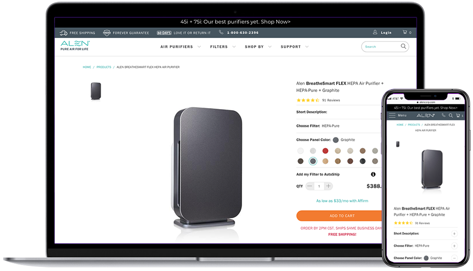
As a User Experience designer at Alen Corp I was tasked with the redesign of the air purifiers customization process on the product pages. The main objective of this project was to provide an efficient and intuitive way for the customer to add a designer panel and a filter to an air purifier and show the impact of their selection in the total price at any given time. Also, the user should be able to find more detailed information if they need to. This should keep into account a mobile first approach and the fact that we had just migrated to a new platform in Shopify plus. Below there is a screenshot showing the old product page and the main problems I would be addressing in the redesign:
- Hero image has not enough prominence.
- 3 column grid makes the page feel overcrowded and conveys a lack of hierachy.
- Too many thumbnails on the gallery section were hard to maintain and created page performance issues.
- UI does not feel engaging enough nor provides a compelling flow in the air purifier customization process.
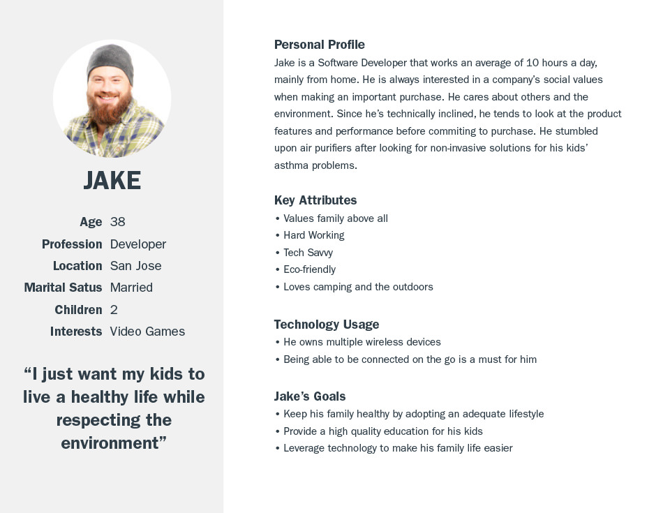
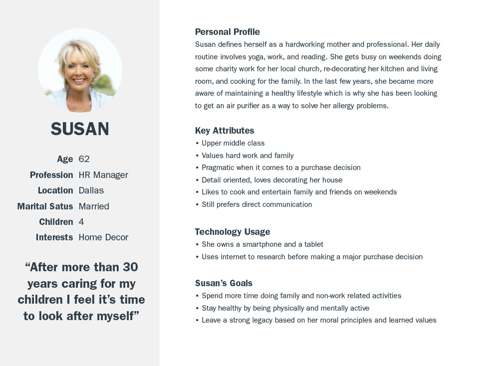
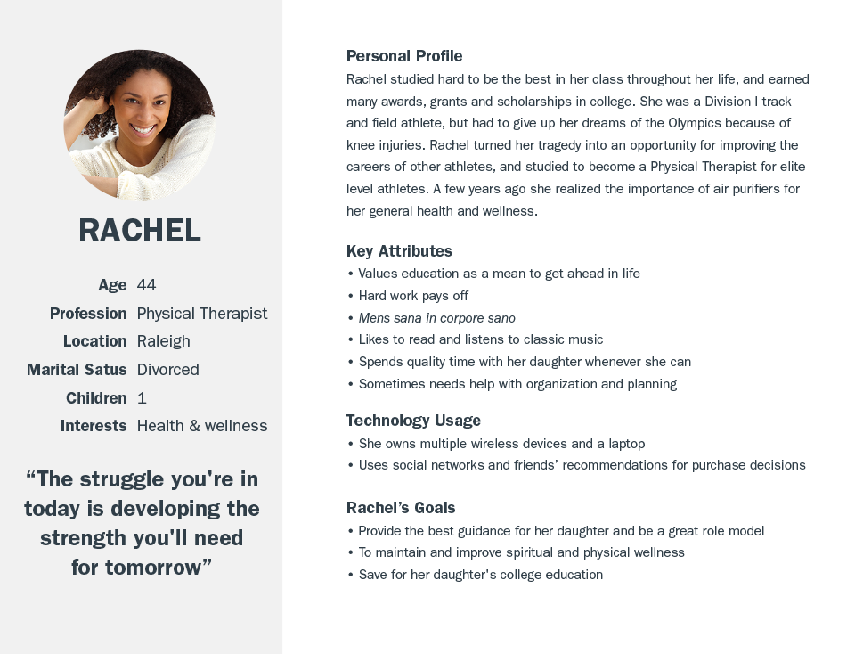
As a part of the UX research process using qualitative data from the Amazon stores and Google Analytics, and then making some assumptions, I came up with 3 personas that represented the company's most typical customers and their goals, needs, and aspirations.
Once the personas were elaborated, 3 main user flows were created and then tied to each persona describing the most likely entry point to the website based on the persona's online behavior, aspirations and preferences. It's worth noting that the data used to ellaborate the personas came from a
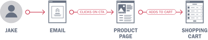
Jake is a busy professional with 2 kids. Jakes main motivation is providing a healthy environment for his family. He receives an email promotion about a new Alen filter for Heavy odors. He clicks on the product CTA that takes him to the product page. He is served a BreatheSmart product page with the Odor-Cell filter option pre-selected.
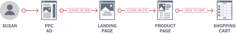
Susan is a retired or soon-to-be-retired woman who’s main hobby is decorating. She stumbled upon a PPC Ad showing a FLEX unit in a beatiful living room. She clicks on the ad and then she is being taken to the Why Design Matters Landing Page. After checking the page for a few minutes she clicks on the FLEX unit with the graphite panel and a product page with that option already selected is served, filter will be secondary in this scenario so the default option will be shown.
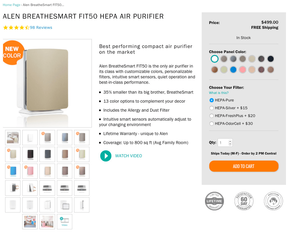
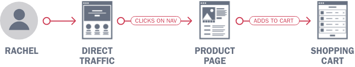
Rachel is a regular visitor and knows the Alen URL at heart. She might have an Alen unit already. Rachel just realized she needs a unit for her living room. She types the Alen URL, choose the unit she feels fit better to her needs from the main navigation –BreatheSmart FIT50. She goes to the BreatheSmart FIT50 product page with the default panel and filter selection. She adds it to the shopping cart.
After the main user flows were identified I then proceeded to design low fidelity wireframes to identify the main interactions and content blocks of the product page and how they would behave in a responsive environment. It was decided –for the sake of efficency– that there would be only 2 breakpoints at the beginning. By the time the redesign was finished, mobile traffic represented more than 28% of the total traffic of this page, however, most people finished their purchases mostly on the desktop version. These wireframes were used as prototypes on the first user testing conducted.
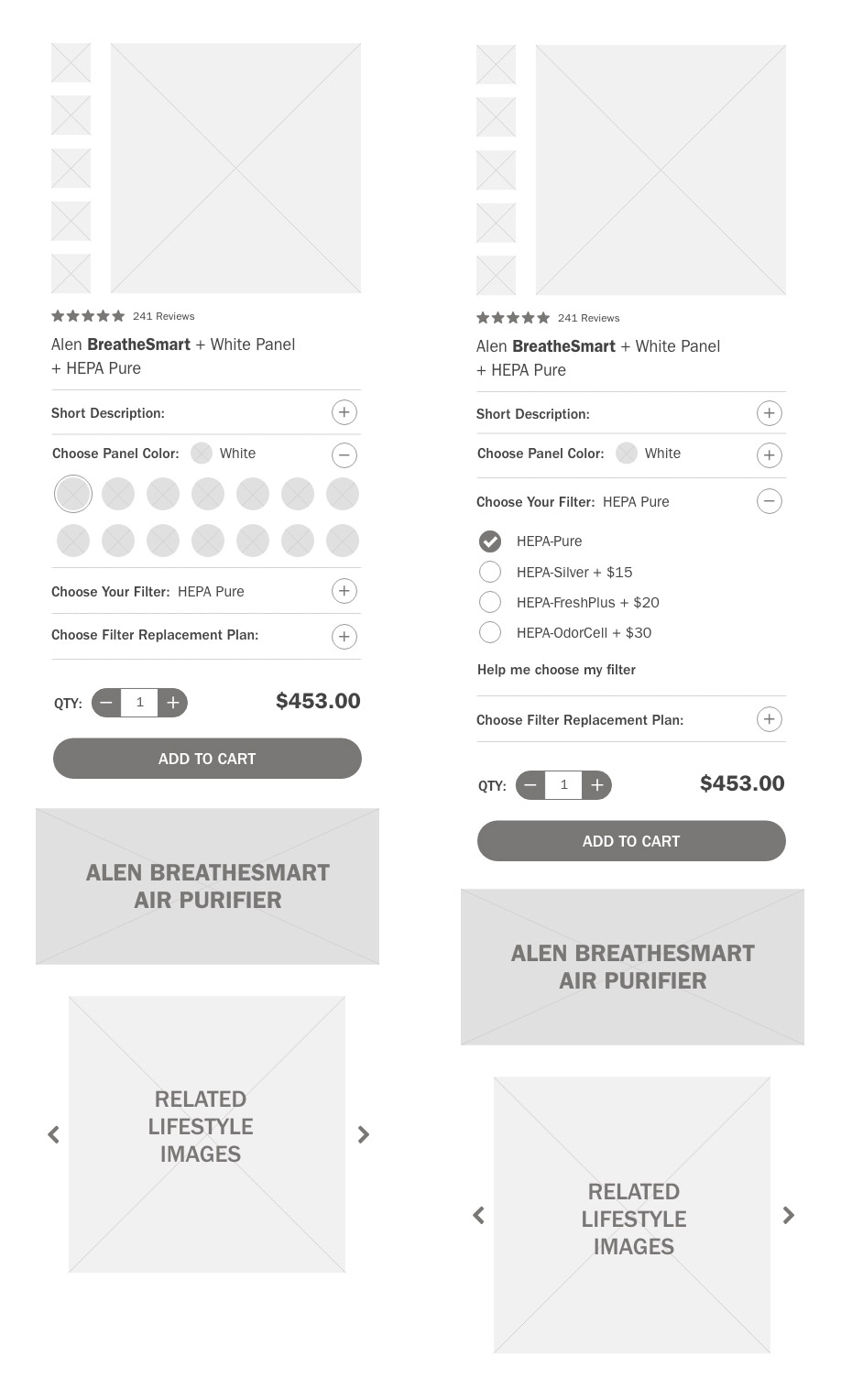
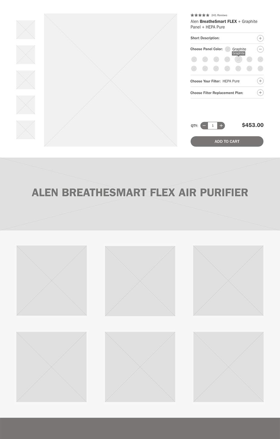
The first round of user testing allowed me to identify some pain points that came directly from observations and feedback from the testers. Things like reversing the order of the designer panel and filter customization sections so filters come first. Reducing the amount of text in the short description panel by having anchor links that goes to a more comprehensive section (deep dive) within the same page. Show the panel and filter option selected once the customization panel was collapsed, among others. These discoveries were translated into modifications made to the original design and a second iteration of wireframes that were subsequently tested.
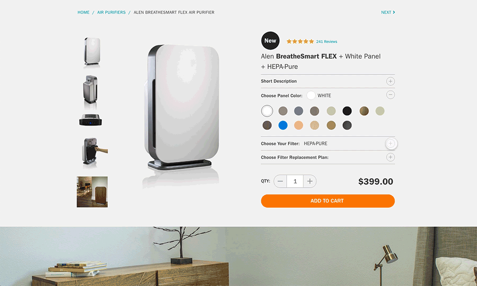
After a few rounds of user testing and revisions, a high definition mockup of the product page was created. This one included some microinteractions that were proven to be effective communicating and delighting users when the customized air purifier was added to the cart. Once this was approved, the required documentation –redlines– was handed over to developers for a Minimum Viable Product implementation.
Animated prototype showing the main interactions and flows in the Product Customization Page
The redesign of the Alen Product page signified an increase of revenue by 31%, in air purifiers sales alone. Other KPI's such as page speed performance, average order value, brand awareness and customer engagement. Likewise, bounce rate was decreased significantly, meaning that users spent more time on the page. All of this happened in a time frame from 2 to 4 months after the page was launched.